Things Learned at GDC - Part 4
Friday, April 13, 2018Main take-aways from talks I've been to at GDC 2018, at the end of all notes I will put up a list of talks I recommend watching on GDCVault.
This post contains:
7. Art Direction for AAA UI.
Next post will contain:
8. Be the best producer for your team
7. 'Art Direction for AAA UI' - Omer Younas
UI is all about SUPPORT.

1. Getting Your Bearings
In UI we design for three of the five senses:
- Touch
- Sound
- Sight
SOUND IS 50% OF THE EXPERIENCE!
Reference Material: 'Design for All 5 Senses'
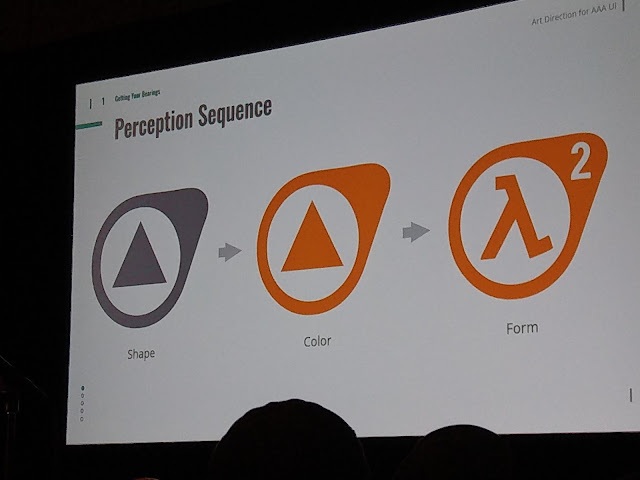
- Keeping in mind cone distribution - green and red.
- Using this information to reflect where to put critical information on screen.
- Distribute colour according to the periphery.
- We want to create points in the composition where the users' eye can rest.


- Not relying on colour alone.
- The readability should work in black and white.
8. Be the best producer for your team
7. 'Art Direction for AAA UI' - Omer Younas
UI is all about SUPPORT.
1. Getting Your Bearings
In UI we design for three of the five senses:
- Touch
- Sound
- Sight
Reference Material: 'Design for All 5 Senses'
- Keeping in mind cone distribution - green and red.
- Using this information to reflect where to put critical information on screen.
- Distribute colour according to the periphery.
- We want to create points in the composition where the users' eye can rest.


- Not relying on colour alone.
- The readability should work in black and white.

- Use cognitive research & Gestalt Theory to assist designs and create more appealing/vivid designs.

Usability Guidelines:
- Maximum of 7 unique items on screen.
- Menus can be a maximum of 3 levels deep.
- Affordances and feedback need to clearly communicate their goals.
- Distribute colour according to periphery, creating a focus area.
- State Changes should be clearly communicated.
- Create a page flow according to elements (E.g. Destiny's Path of Least Resistance)
- Allow for help / hints. Consistency.

Examples:
Maximum of 7 Unique Items on screen


Menus are maximum 3 levels deep

Create a focus area

Communicate state changes clearly

Create a page flow between elements on screen

Offer help and hints in a consistent manner

Cheat Sheets!
Allow yourself to use them!

2. The Process
Using grid types.


Using grid types in combination with aspect ratios.


Keep a safe frame of 90% (screen bleeding, varying screen resolutions, etc.)

Alignment and Anchoring
- Aligning/grouping your UI elements
- Anchoring in screen space

Examples:

- Player kills in top right
- Match time/team progress top centre
- Reticle centre
- Ammo/Weapons/hotkeys bottom right
- Minimap bottom left
- Objectives centre left

Look at the Bigger Picture
- Legibility/Readability
- Branding / Style & Tone
- Limit font variations (TWO MAXIMUM)
- Trends/Timelessness
- Localisation
- Pricing/Budget
- 60-120 characters maximum per line.
- Allow for 40% overflow (localisation)
THE 6FT RULE
When designing for big screen audience, elements need to be readable/legible from 6ft away from the screen.
Buy font families!

Font Weights

Colour Theory
- Maximum of 5 unique colours in pallette
- Avoid fully saturated colours (screen bleeding)
- Colour luminance range - do not match your colours with the games' environment
- Do NOT rely on colour! Always rely on shapes first.


0 reacties